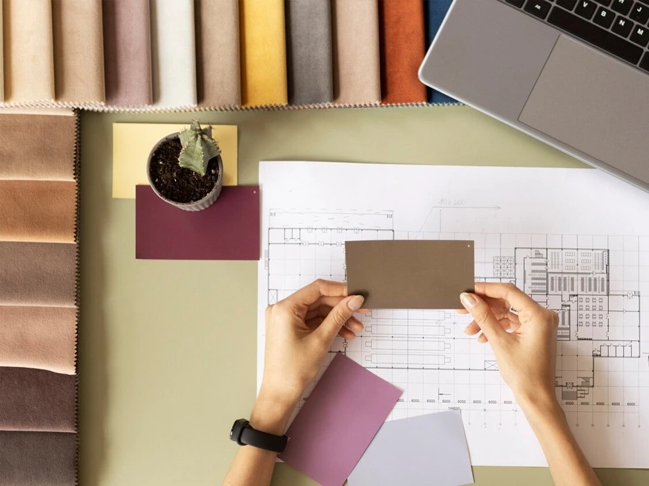
In this blog, we will present to you another 250 square yard i.e. 10 marla layout and it’s interior. Style-wise this residential is along neo-classical lines. Neoclassical means that it is classical in style but with some modern features; All the elements and ornamental details are in the classical style but to give it a fresh look and so that the spaces do not look traditional and old-fashioned, we have the neo-classical style we highlight some details and in a good way. Assalam Alaikum friends, I hope you will all say hello. Today we present to you another 250 square yard i.e. 10 marla layout and interior. So basically style-wise we will explain it with neo-classical lines. Neoclassical means that it is classical in style but with some modern features; All the elements and details are in the classic style but to give it a fresh look and the design does not look traditional and old-fashioned, we have highlighted some features in a modern language. Some functions and spaces for example bathrooms, we have completely modernised to achieve greater convenience and for maintenance. For the interior design for this blog we will mainly focus on some bedrooms and its bathroom, as well as discuss the lobby design.
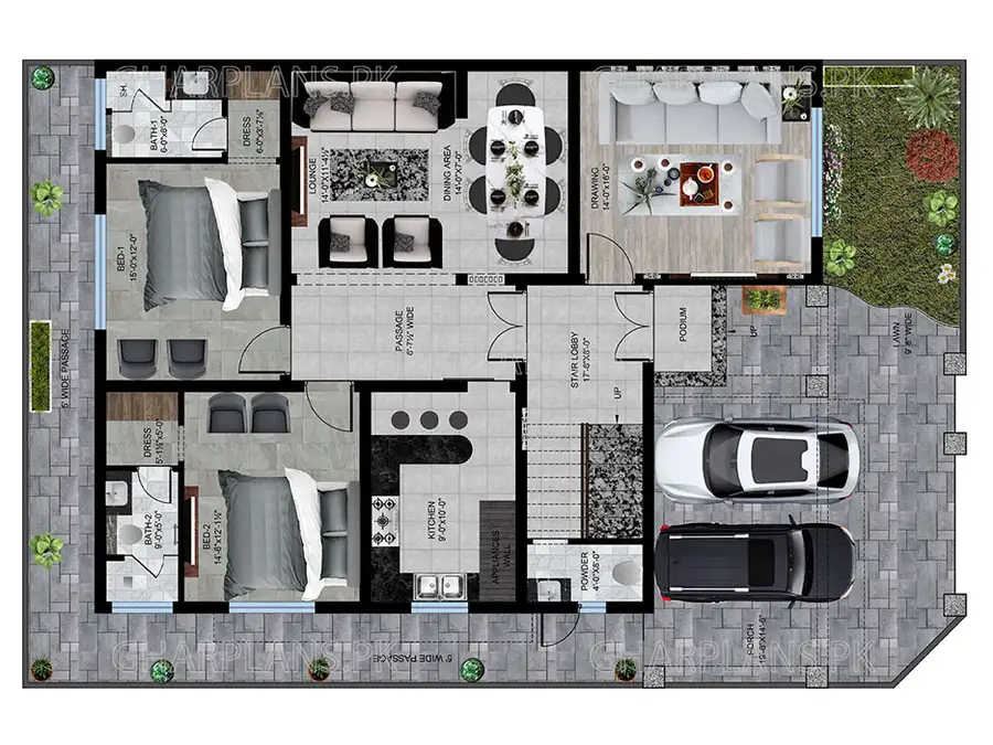
So first let’s go through the layout- here, we have allocated. 5′ of compulsory open space to the left and to the rear and to the front we allocated a 9’6″ wide lawn towards the right and then a 2 car capacity porch to the left, which is 19’8″ by 14’6”. The entrance area is in the middle with a landing podium of 2 steps leading directly to the lobby.
As we enter the lobby, we come to the staircase that leads up to the mumty on the roof. Then behind the stair area we have a powder room on the ground floor which is 4′ by 8′. Then on our right is a drawing room which is 14′ by 16′. By combining the front area with the lobby and stairs we have separated the private areas from the further side of the house with a door. This separation works for security where we have a double door in the lobby before entering the main private house spaces. Then we’ve planned a fairly wide corridor space in the middle of the house which is 6’7.5”. Toward the right is a large hall essentially combines the dining and lounge areas. The lounge area is 14′ by 11’4.5” while and the dining area is 14′ by 7′. We have subtly zoned both spaces by projecting the column slightly forward through adding extra wall area. Then to our left is a fairly good sized kitchen measuring 9′ by 10′ and we have added a breakfast bar to the front with seating for 3 stools.
On the ground floor we have 2 bedrooms, both of which are quite large in size, one is 14’6″ by 12′ and the other is 15′ by 12″ both with attached dressing areas and bathrooms. The bathroom sizes are 9′ by 5′ and 6′ by 8′.
Next we will discuss the first floor plan. We have given a large balcony at the front which is 20′ by 12’6″. Because in this house we have planned the lawn a bit smaller, we have compensated for that by extending the outdoor entertaining area in the form of a large terrace. This can fulfil the family’s outdoor entertainment, relaxation and hosting needs.
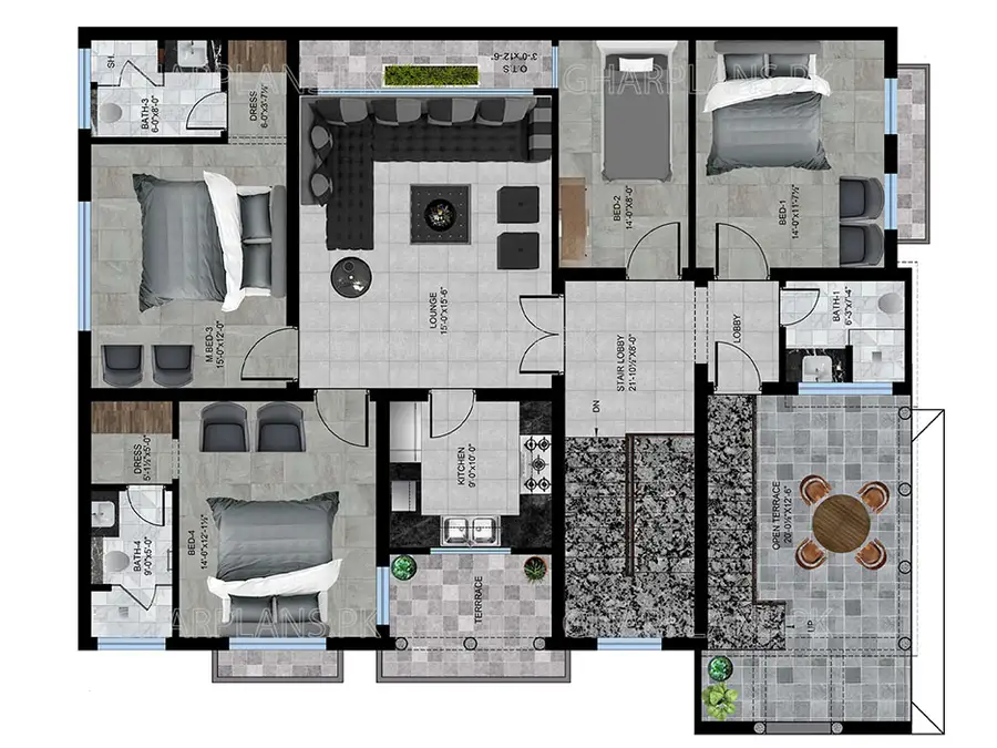
This terrace also has a staircase towards the side which remains very useful and convenient connecting both outdoor areas. For example, if the family is hosting some guests or have a function at their house, the roof is directly accessible from the terrace and connected as as a continued outdoor space.Then after the stair lobby we have planned 2 bedrooms. One is of a smaller size that can be used as a children’s bedroom and measures 14′ by 8′ and does not have an attached bath. Then the second bedroom next door is 14′ by 11′ 7.5”which is does not have an attached bath either. We have provided a common bathroom in this area next to the lobby which is 6’3″ by 7’4″ so if guests need to use the bathroom on the first floor they would not have to go through the bedrooms to access the bathroom. This way the bathroom can be used directly from the lobby by guests which is good for the privacy of the home’s occupants.
Then we have kept the family lounge of this floor of a fairly large size which is 15′ by 15’6″. Here we have a skylight feature towards the right side that brings in extra sunlight to this central area. Through this feature we have tried to give this family lounge a spacious and bright look; which is also a good idea for daylight and energy savings. Then we have provided another full kitchen on this floor which is 9′ by 10′. There are 2 more large sized bedrooms on this floor. One Bedroom on the left is 14’6″ x 12′ with an attached bath measuring 9′ x 5′ and attached dresser measuring 5′ x 5′. Then we have another personal terrace connected to this bedroom on the left that comes over the side alley of the house. Then to the right comes our master bedroom which is 15′ by 12′ and has an attached bath as well which is 6′ by 8′ and a dresser space of 6′ by 3′ 7.5”

So that concludes our planning. Now let’s move on to the interiors. First of all, we’ll start with the lobby, which we have designed very formally because it is an important guest serving area of the home; that we have separated from the private zones of the rest of the house. This space is mostly treated in a neo-classical fashion. As soon as you enter here, you will see a beautiful rectangular medallion on the floor. This design is something that not every craftsman can achieve so we will execute this kind of flooring through specific vendors of flooring medallions and patterns; which is made in marble, chips and stone. A modern element of neoclassical here are the metal stairs which are usually not found in traditional classical interiors. We have mostly used classical decorative elements here but modernized the stairs, because through this stair design, the space will appear more spacious.Then we have given a wooden finish on the bottom of the steps and marble texture tiles on the top of the steps. We have beautified the top stair wall with ornate moldings and we have finished some of these moldings in antique-tone silver paint. Then, on 3 sides of this lobby, we have enhanced the windows from the inside very beautifully in a more Arabic sort of language. Here the semi-circular tops of the windows are fixed with printed glass and for the rest of the window space we have fitted laser cut screens with arabesque patterns. We have kept the ceiling here very grand and have finished the borders in moldings and further highlighted these borders with strip lights. In the middle of the false ceiling we have made a slight dome, with further mouldings inside mouldings inside and a classical lamp-chandelier fixed in the middle.
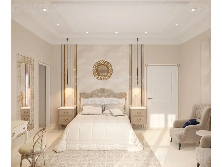
Next, we will discuss a classical bedroom. It is mostly finished in cool and light colors and gives a very calming feel. Whenever you want to create a calm space, it is important to use fewer colors or a single base shade so that the space does not appear too visually confusing. Here our base shade is a light-cream/beige tone. For the bed wall we have given a soft white and beige wallpaper in the center with a golden mirror fixed on top. On the sides of the bed wall we have given a white fluted texture in wood which is today a popular feature of modern design. Then to enhance the sides further we have given modern pendant lights in a golden finish, above the bedside tables. The bed set here is also classical in style finished in a single beige tone.
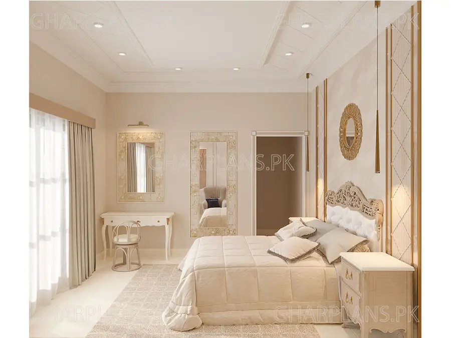
Then we have 2 antique style mirrors on the side wall for a full length mirror and one for a dressing table. They basically have a rough textured border and a mirror fixed in the middle. We have also placed a modern beige rug in the center to give this room a soft and cozy feel. On the other wall, we have added wallpaper to highlight the sitting area and this wallpaper is fixed in the middle of the mouldings. We have them placed a modern abstract painting on the wallpaper area.
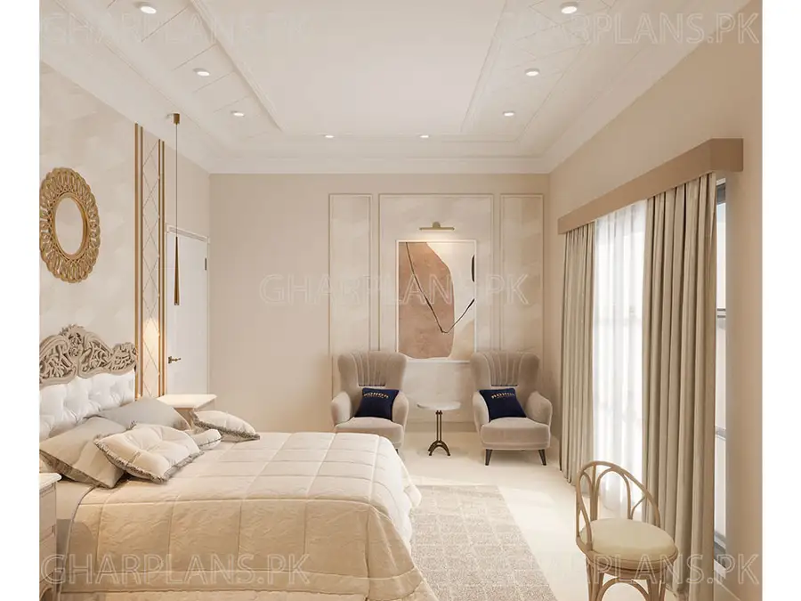
Usually in classical interiors we see classical realistic paintings which can sometimes give your interiors a boring and old-fashioned look. So here we have gone for an abstract painting which gives the space a fresh, modern feel. Although the ceiling here is classic, it is on the simple side as we have not kept the skirting and borders too detailed and flowery.
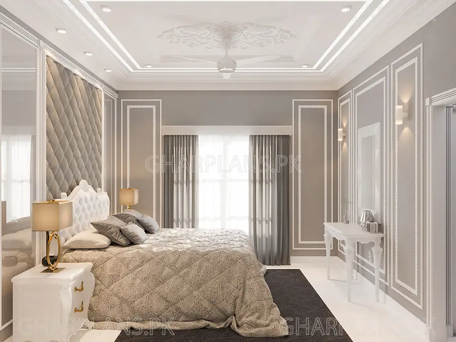
Next, we will show you another classic bedroom that is slightly different from the first one in the sense that it is in a darker tone – but still in the neoclassical style. We have given it a base tone of medium gray and then finished the moldings in white for a high contrast look.The bed wall has a full length board of upholstered and cushioned fabric in the center with moulding borders and full length mirrors to the bedsides. The bed set is in a different stark white tone to highlight it against against the gray on the walls. You will notice that even though we have used 2-3 different shades of grey in this room, for example the wall is a different grey, the carpet is a different grey, the cushion fabric paneling is a different grey, the design is still harmonious. The reason is that we have continued the mouldings in white throughout the room and not introduced more different or new shades. The ceiling is not continuously classic here because on one side where the bed is we have given very classical mouldings on the ceiling but on the other side where we have the sitting area, we have kept it modern with thin thin wooden lines beams representing a modern contemporary style. Then on one wall, opposite the bed, we have more ornate white mouldings and against this wall we have placed a white classical console with a mirror.
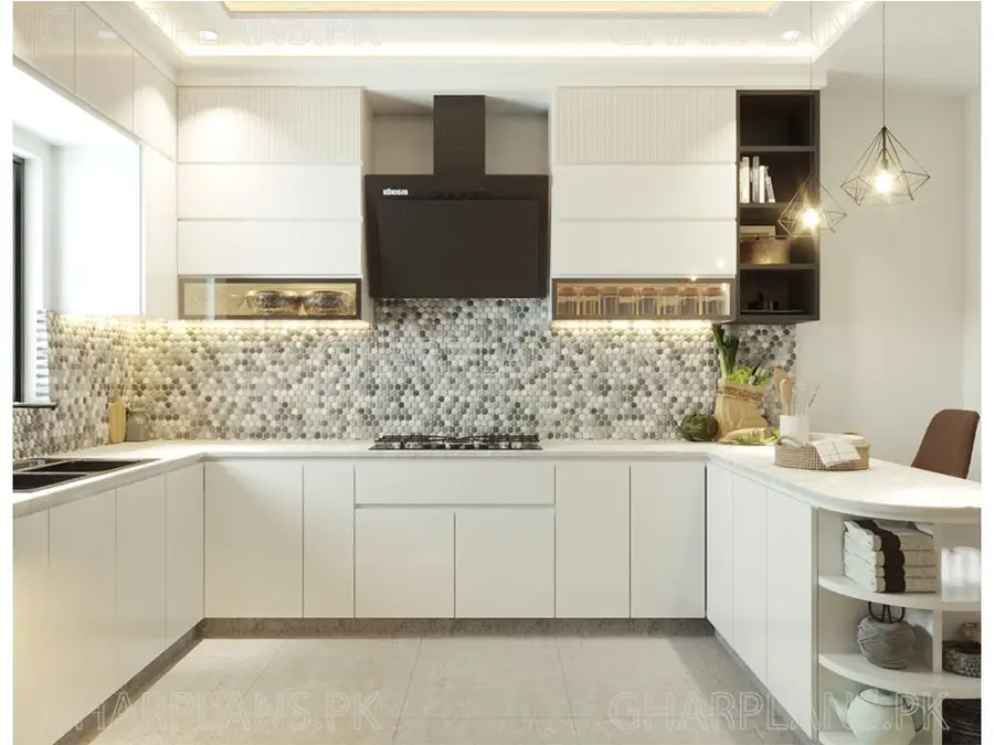
Now we will discuss the kitchen of this house. The kitchen is completely homely and modern. It’s on a black and white theme but we’ve used backsplash tiles in different variations and tones of gray for a fresh feel.The cabinets are mostly white with a handleless design but we have finished some of the cabinets in black. For example, the appliances on the wall are in the black section. With the black appliances, this black cabinetry section looks modern and elegant. It is an important point to note that we have given ‘matte’ black finishes and not glossy black because glossy black has a different theme and matte black has a totally different contemporary look
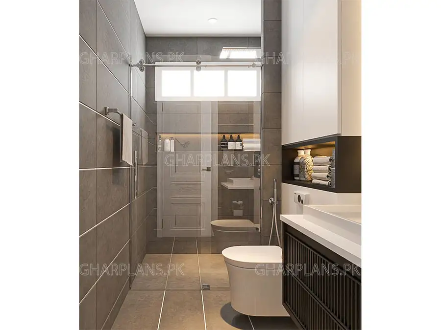
Next we will discuss 2 modern bathrooms of this house. This style is completely contemporary. It does not have any classical elements. Because classicizing bathrooms is not a maintenance-friendly idea and classic bathrooms tend to look outdated very quickly. One bathroom here uses a white, gray and black theme. We have used gray porcelain tiles in a matte finish for the floor and wall tiles. We have installed a different tile on the vanity area which is a white textured tile with small 3D squares and to further highlight the 3D texture of the wall we have fixed strip lighting behind the mirror. The design of the mirror is also very interesting with a semi-circular bottom. The vanity has floating cabinetry finished in matte black with a ribbed design. The projection of the toilet wall we have treated by adding cupboards towards the top and then in the middle we have created a niche.
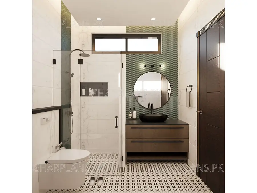
The next bathroom we will discuss is also completely modern and has a green, black and white theme. Here we have a mosaic tiled floor with a black floral cross pattern and the rest of the walls are finished in marble-texture tiles. The vanity area is finished in a green hexagon-pattern tile in full-height. On this wall, we have fixed a circular mirror with a black border. The sink here is in matte black and so matching with this darker theme, the cabinets are also in darker tones wood. The same green hexagonal tile for the vanity section we have continued in the shower area in a small wall section. The borders of the shower cubicle have minimal black framing.
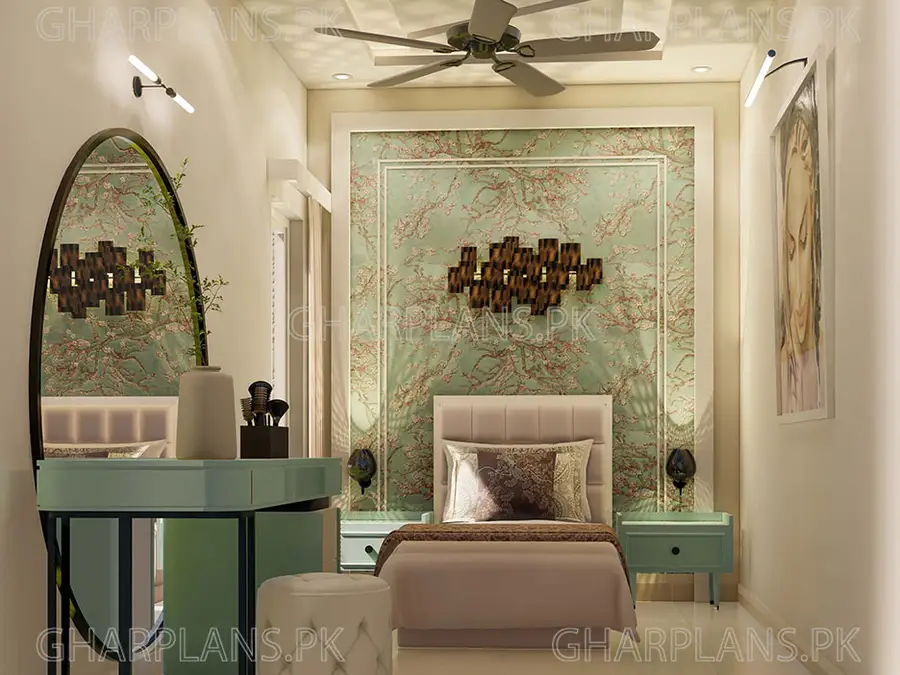
Lastly, we’ll discuss another bedroom of this house which is also classical but has a completely different theme because its colors patterns are more bright and bold. Here we have given a green wallpaper with a pink floral print on the bed wall. We’ve picked a modern bed here in the pink shade picked from the wallpaper. The bedside table and dressing table are in green, same as the wallpaper. The main attraction of this room is this bed wall as a feature wall where to highlight the wallpaper as an art piece, we have bordered it in a white wooden border; reminiscent of painting frames. Within this border, there are further thin white mouldings. Then in the center of this feature wall, we have fixed a wall sculpture in a brown and gold tones which also has some light fixtures integrated into it.
If you want to see video about this layout plan click on the given link: